There’s something deeply satisfying about a card that looks like it took far more effort than it did — and this one absolutely delivers that feeling.
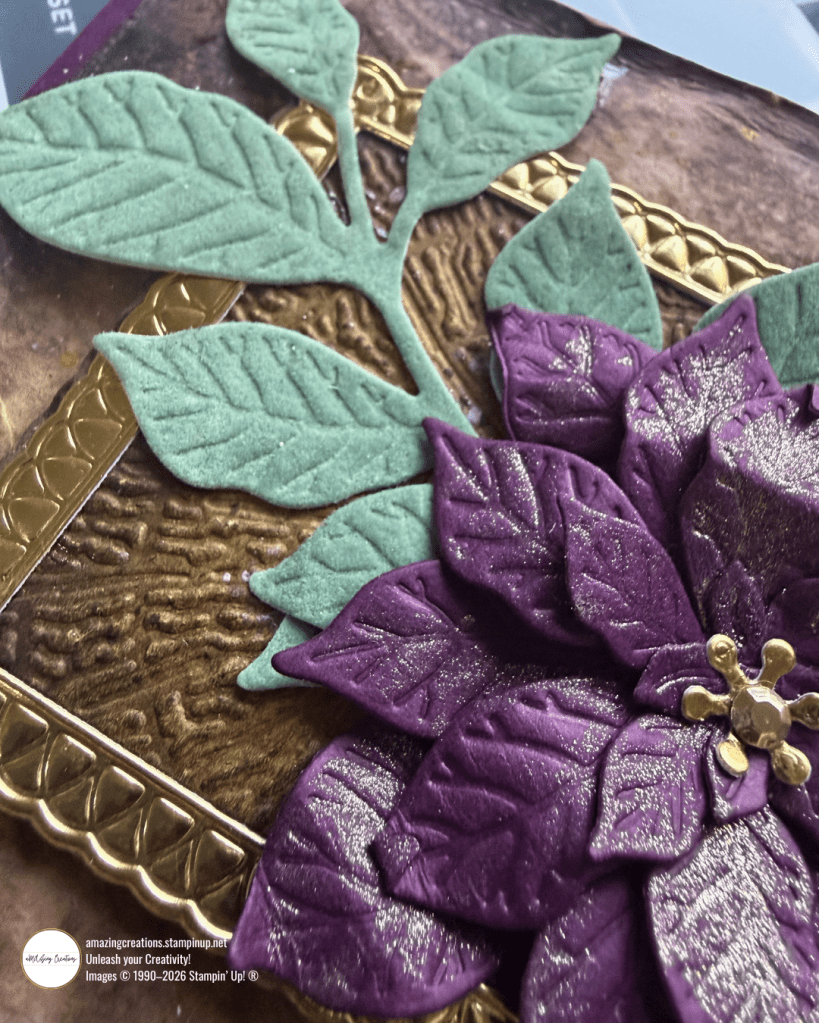
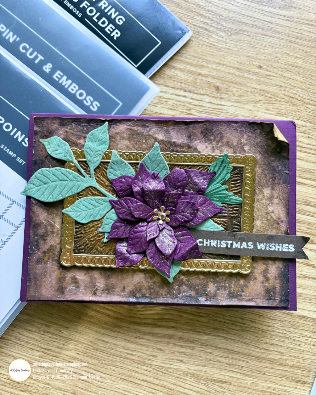
This Christmas card started as an experiment in colour. Poinsettias are traditionally red, but Blackberry Bliss felt more interesting to me. More unexpected. More me. And once I committed to that direction with the Pretty Poinsettia Bundle everything else fell into place beautifully.

The Background
The base layer is Crumb Cake cardstock, but not straight off the pad. I scrunched it first to add some natural texture and movement, then inked over it with Pecan Pie and Early Espresso — building up that warm, aged, mixed media feel. It’s a simple technique but the result looks wonderfully layered and intentional.
This sits on a Blackberry Bliss card base, which ties the whole colour story together.
The Frame
The Textured Tree Ring 3D Embossing Folder gave the centre panel its beautiful bark-like texture. After embossing, I used ink to bring out the raised detail — just a light application over the surface to highlight the texture and give it that antique, dimensional quality.
I then framed the panel using the Impressions plate from the Phrases & Frames Dies. Running it through the die gives it an embossed border with real depth — it’s one of those small details that lifts a card from lovely to luxurious.
The Leaves
The leaves are cut from Peaceful Pine Velveteen Soft Flocked Specialty Paper — and if you haven’t worked with this paper yet, it is worth it. The soft, velvety surface adds beautiful tactile contrast against the metallic and embossed elements. I also ran the leaves through the Impressions plate to add vein detail and a little more dimension.
The Poinsettia
The poinsettia is die-cut from Blackberry Bliss cardstock using the Pretty Poinsettia Dies, then run through the Impressions plate for texture and definition. Once cut, I curled each petal individually — this is the step that really brings it to life and gives it that lush, three-dimensional look.
A touch of Wink of Stella Glitter Brush over the petals adds a subtle shimmer that catches the light beautifully. The centre is finished with gold foil cardstock, punched and layered to create that classic poinsettia detail.
The Sentiment
The sentiment is white heat embossed onto dark cardstock and cut into a banner shape with a notched tail — simple, clean, and a lovely contrast against all that rich colour and texture.
The Finished Card
What I love most about this card is how each element contributes something different — texture, shimmer, softness, structure — and yet they all work together cohesively. The Blackberry Bliss and Peaceful Pine combination feels festive without being traditional, and the gold accents tie everything together beautifully.
It’s a wonderful reminder that your Stampin’ Up! products can take you somewhere unexpected when you’re willing to play.
Ready to make your own? You can shop all the supplies used in this project through my online store — everything is ready to add to your cart.
Remember: Spend $125+ this month = Product of the Month for $9!
What We’re Loving
If you love experimenting with your supplies and trying new ideas, make sure you’re on my email list — I share inspiration, sketches and colour combos.
Unlock Scrapbooking, Cardmaking Tips & Inspiration! Subscribe Today
Til next time, see you soon & keep creating!
Maz

What do you think?